
Delinquency Report
Comprehensive delinquency analysis and risk management insights for your lending portfolio.
The Delinquency Report delivers essential delinquency metrics and risk indicators that power effective portfolio management across all lending products. Whether you need daily collections workflows or strategic risk analysis, this report provides both current delinquency status and historical performance data to support data-driven decisions.
Available as CSV downloads for immediate use or through Data Direct database access for custom analytics and portfolio aggregation.
Key Data Points
| Category | Fields | Purpose |
|---|---|---|
| Account Info | Account ID, Line of Credit ID, Origination Dates, Status | Core account identification and lifecycle tracking |
| Financial Metrics | Credit Limit, Principal/Interest/Fees Balances | Current financial position and exposure |
| Delinquency Status | Days Past Due, Past Due Amounts, Stabilization Amount | Real-time collection targets and risk assessment |
| Risk Analytics | Current & Previous Month Delinquency Buckets, Tags | Trend analysis and roll rate calculations |
Use Cases by Team
Collections Teams
Daily Workflow Management
- Priority Queues: Sort by delinquency bucket and past due amounts to focus on highest-risk accounts
- Collection Targets: Use stabilization amounts to set clear recovery goals for each account
- Performance Tracking: Monitor bucket migration to measure collection effectiveness
Collection Strategy Optimization
- Cure Rate Analysis: Track accounts moving from delinquent to current status
- Resource Allocation: Identify account segments with highest recovery probability
- Campaign Effectiveness: Measure impact of collection strategies on bucket movement
Risk Management
Portfolio Risk Assessment
- Delinquency Distribution: Analyze bucket composition across portfolio segments
- Trend Identification: Monitor changes in days past due and aging patterns
- Loss Forecasting: Use roll rate analysis to predict future charge-offs
Strategic Risk Management
- Vintage Analysis: Compare delinquency patterns by origination cohorts
- Credit Policy Impact: Assess how underwriting changes affect portfolio risk
- Market Cycle Analysis: Track performance across different economic conditions
Executive Leadership
Portfolio Performance Monitoring
- KPI Dashboards: Track key metrics like overall delinquency rates and past due balances
- Trend Analysis: Monitor month-over-month changes in risk indicators
- Benchmark Comparison: Compare performance across products and markets
Finance & Accounting
Financial Reporting & Compliance
- Loss Reserves: Calculate accurate CECL provisions using detailed aging data
- Regulatory Reporting: Extract standardized metrics for regulatory submissions
- Investor Communications: Provide consistent risk disclosure data
Advanced Analytics
Roll Rate Analysis
Using Canopy's Delinquency Report, we provide the raw data for your team to construct advance analyses like roll rates
A metric that measure the movement of loans (or accounts) between different stages of delinquency or credit risk over time. It essentially track how loans "roll" from being current to past due, or from one level of delinquency to a more severe one (e.g., from 30 days past due to 60 days past due). Analyzing roll rates helps lenders predict future loan losses, assess credit risk, and optimize collection strategies.
Given you've downloaded, the report, using simple Python scripts (sample script below), turn the report into:
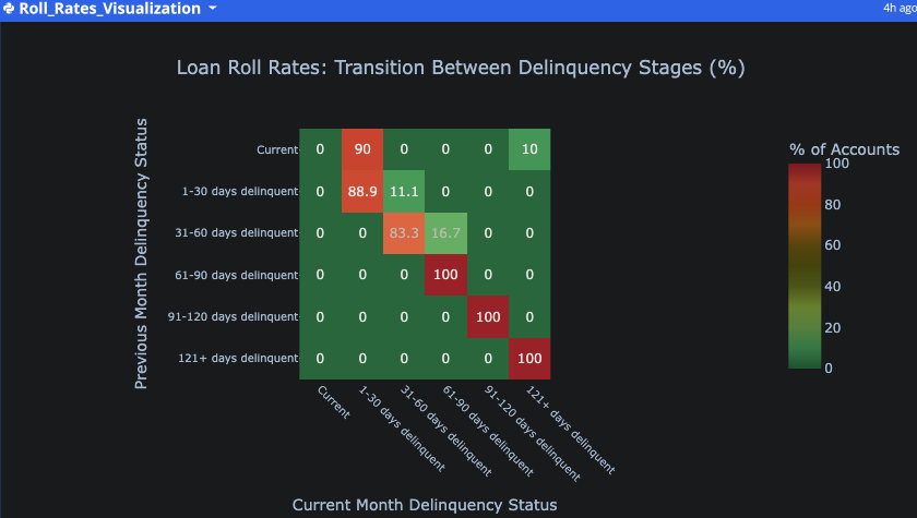
Key insights from the visualization:
- The diagonal shows accounts that stayed in the same status (e.g., remained current or remained delinquent)
- Green areas indicate positive movements (accounts improving their status)
- Red areas indicate negative movements (accounts worsening their status)
- The numbers show the percentage of accounts that transitioned between each stage
import pandas as pd
import plotly.express as px
import plotly.graph_objects as go

# Get the delinquency data from the table
df = q.cells("delinquency_report_2025_07_24__2_.csv")

# Clean the data - fill empty values in Last Month Delinquency Bucket with 'Current'
df['Last Month Delinquency Bucket'] = df['Last Month Delinquency Bucket'].fillna('Current')

# Define the correct order for delinquency buckets
bucket_order = ['Current', '1-30 days delinquent', '31-60 days delinquent', '61-90 days delinquent', '91-120 days delinquent', '121+ days delinquent']

# Ensure the columns are in the correct order
current_order = [col for col in bucket_order if col in df['Delinquency Bucket'].unique()]
last_month_order = [col for col in bucket_order if col in df['Last Month Delinquency Bucket'].unique()]

# Add 'Current' to current_order if it's missing
if 'Current' not in current_order:
    current_order.insert(0, 'Current')

# Add 'Current' to last_month_order if it's missing
if 'Current' not in last_month_order:
    last_month_order.insert(0, 'Current')

# Create a transition matrix showing movements between delinquency stages
transition_matrix = pd.crosstab(df['Last Month Delinquency Bucket'], df['Delinquency Bucket'], normalize='index')

# Reorder the matrix to ensure correct bucket order
transition_matrix = transition_matrix.reindex(index=last_month_order, columns=current_order)

# Convert to percentages and round for better readability
transition_matrix = (transition_matrix * 100).round(1)

# Fill any missing values with 0
transition_matrix = transition_matrix.fillna(0)

# Create a heatmap visualization of the roll rates
fig = px.imshow(transition_matrix,
                color_continuous_scale='RdYlGn_r',
                text_auto=True,
                title='Loan Roll Rates: Transition Between Delinquency Stages (%)',
                labels=dict(x="Current Month Status", y="Previous Month Status", color="% of Accounts"),

                # Set better dimensions for readability
                width=900,
                height=700)

# Update layout for better readability
fig.update_layout(
    xaxis_title="Current Month Delinquency Status",
    yaxis_title="Previous Month Delinquency Status",
    plot_bgcolor='white',
    font=dict(size=12),
    title_x=0.5
)

# Update axis text for better readability
fig.update_xaxes(tickangle=45, tickfont=dict(size=10))
fig.update_yaxes(tickfont=dict(size=10))

# Add a color bar with better labeling
fig.update_traces(colorbar=dict(
    title="% of Accounts",
    tickfont=dict(size=10)
))

fig.show()